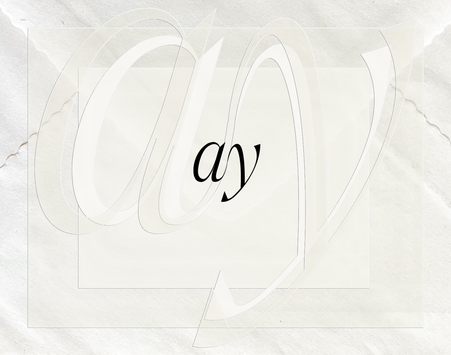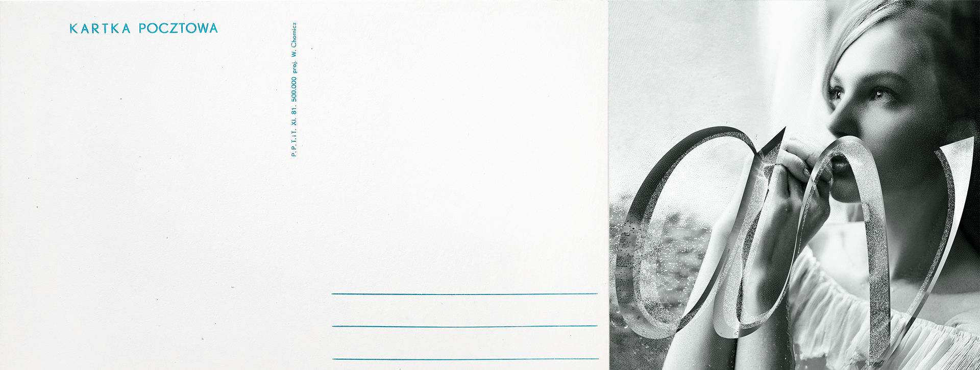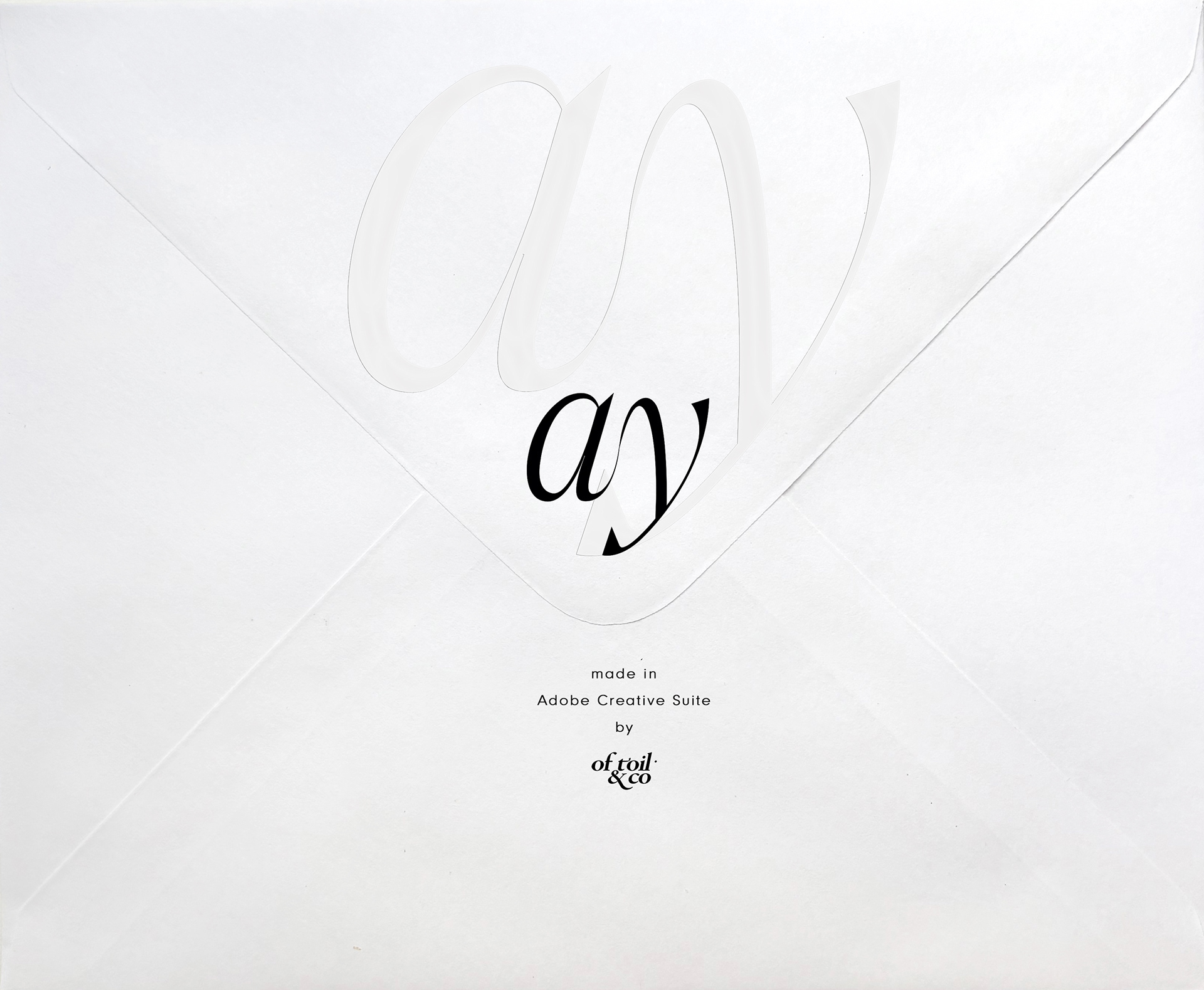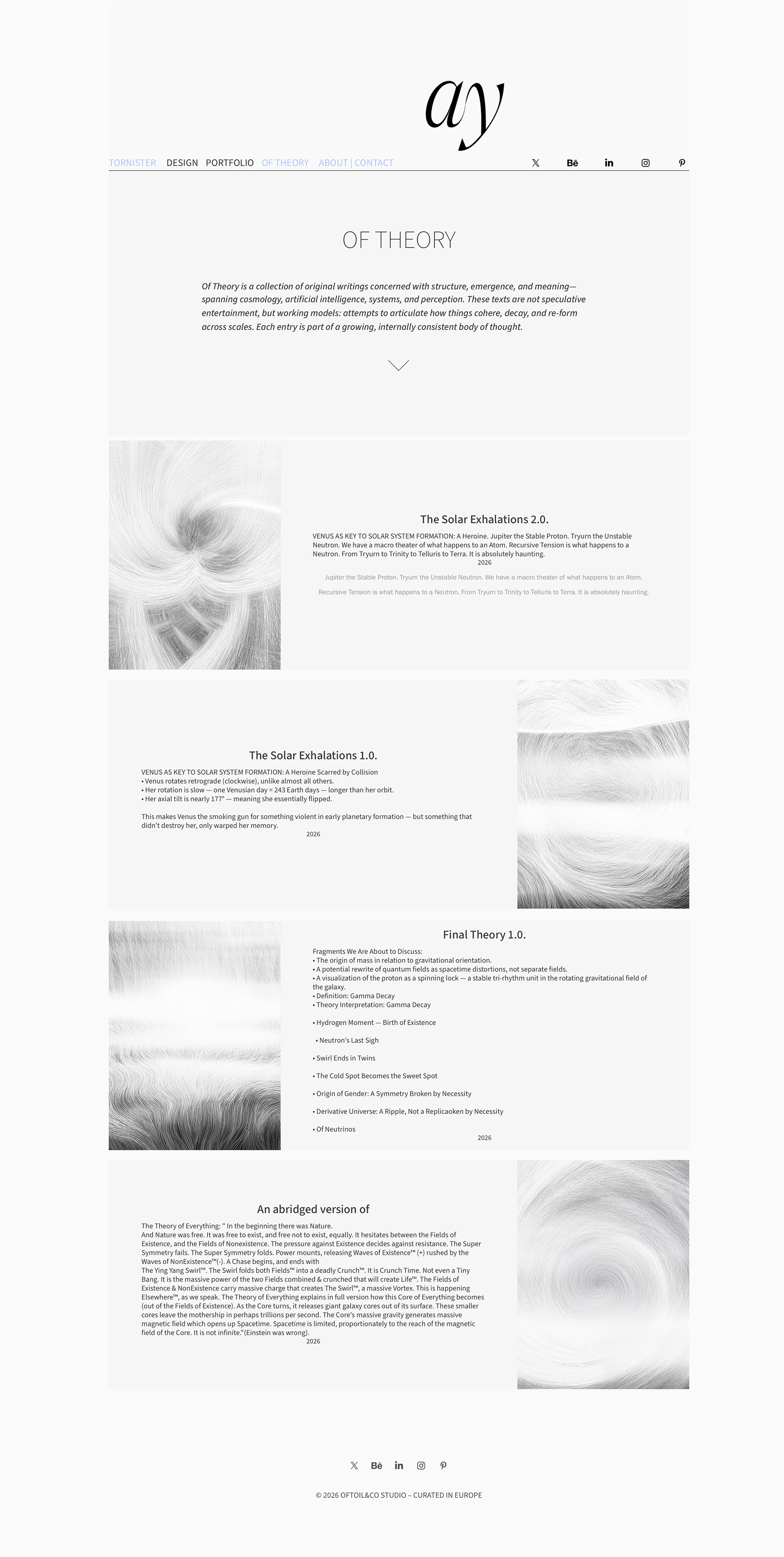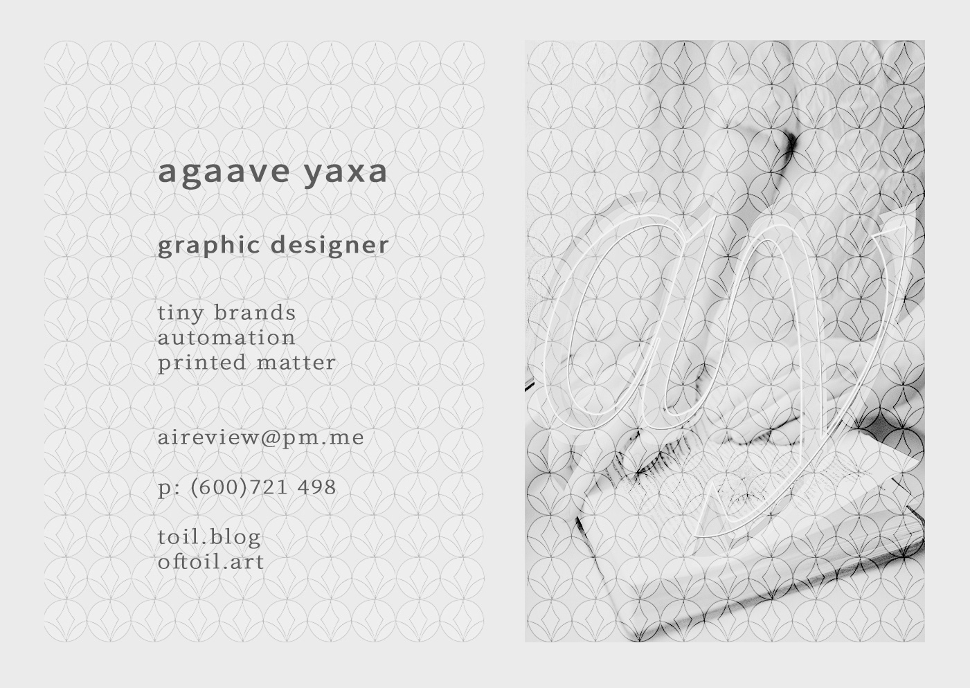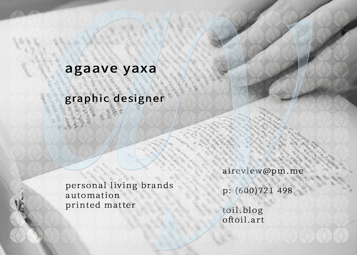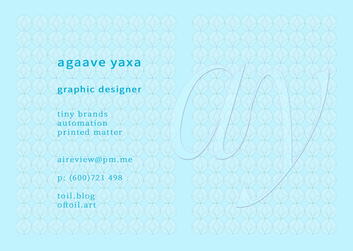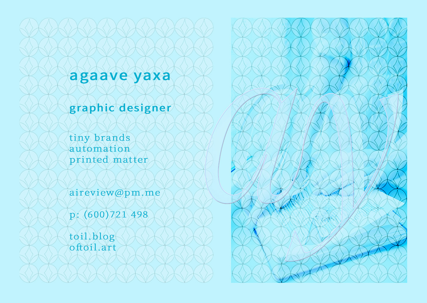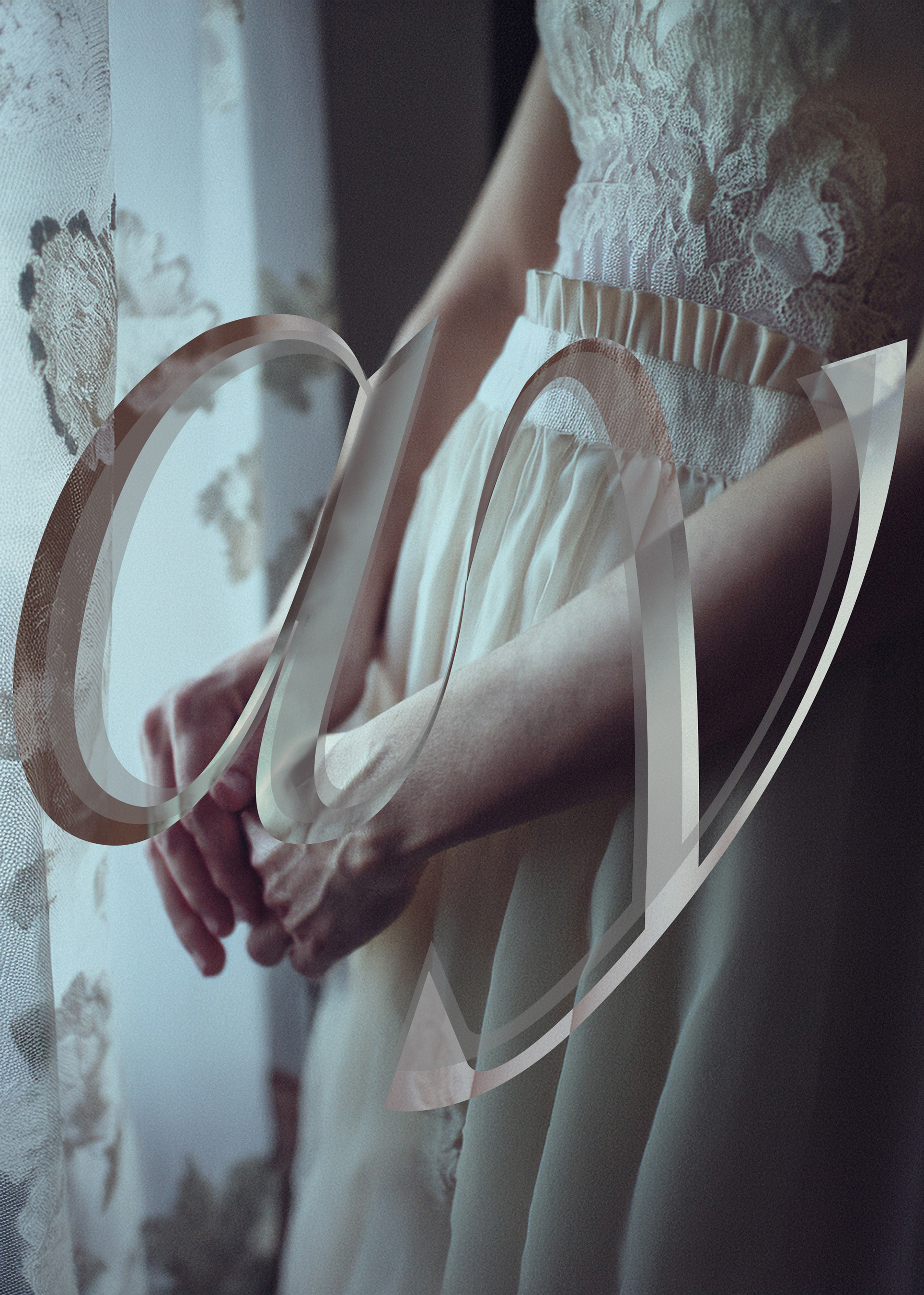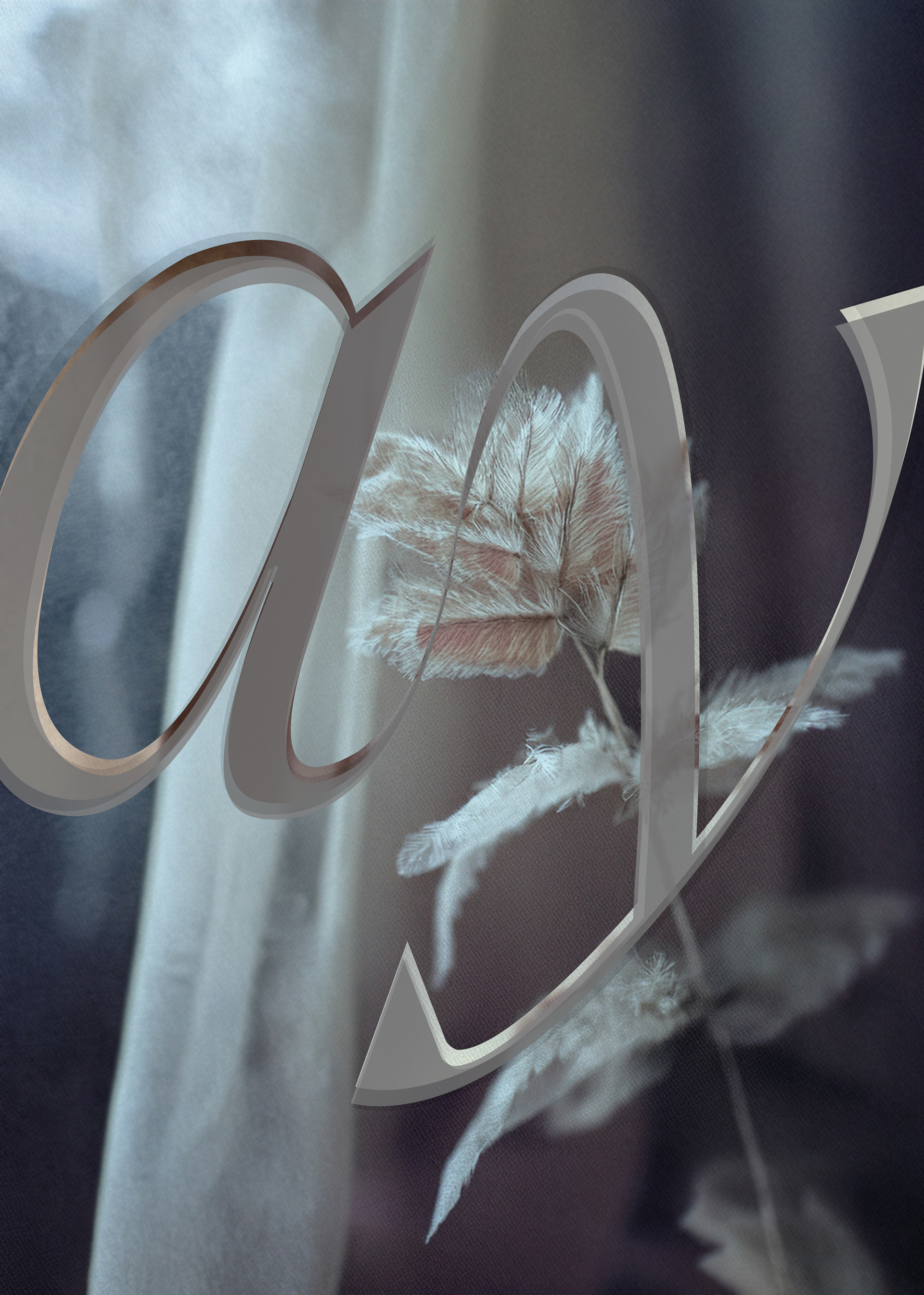

Designed for & by Agaave Y., this project presents a complete personal identity built around a custom typographic monogram and a coherent editorial system. Designed to scale across web, stationery, social media, and print, the identity demonstrates how subtle typographic decisions — spacing, weight, rhythm — can create presence without noise. The project is offered as a reference and as a purchasable model for bespoke personal branding, tailored for individuals seeking clarity, coherence, and longevity in their visual identity. — A restrained personal identity built around a custom monogram derived from Noe Display Thin Italic. The mark emphasizes gesture, spacing, and anticipation rather than authority — designed to feel present without being imposing. The supporting typographic system pairs expressive display with Source Serif 4 and Source Sans 3, creating a functional hierarchy suitable for editorial, web, and printed applications. Developed as both a personal foundation and a reference project for bespoke personal branding.