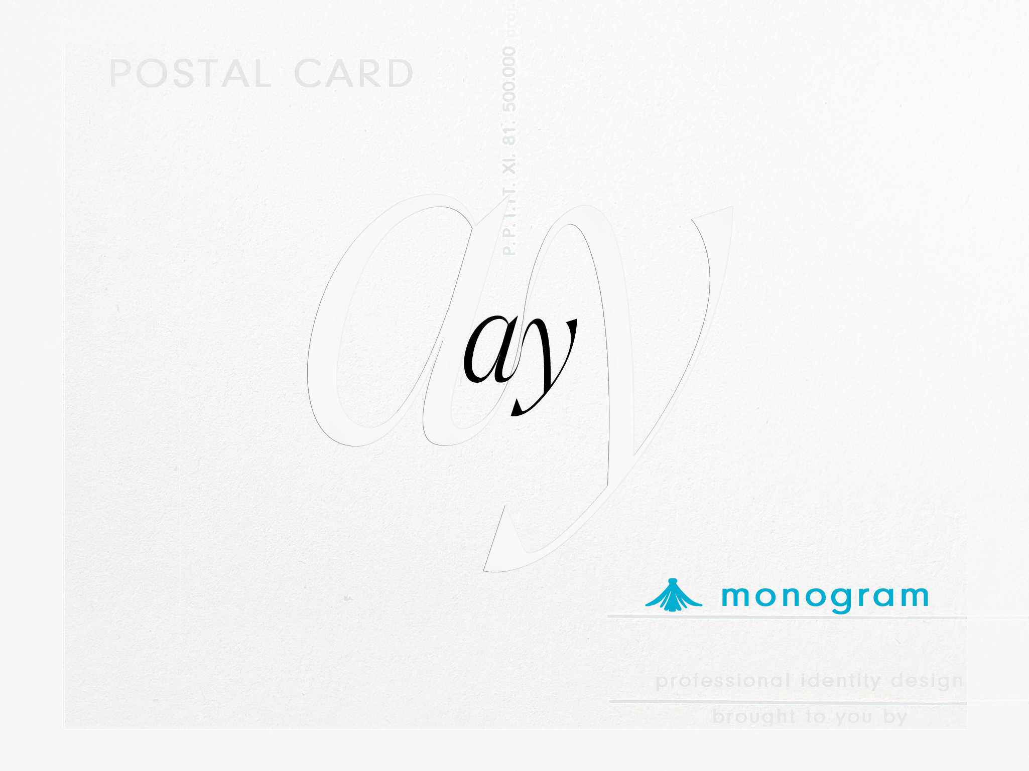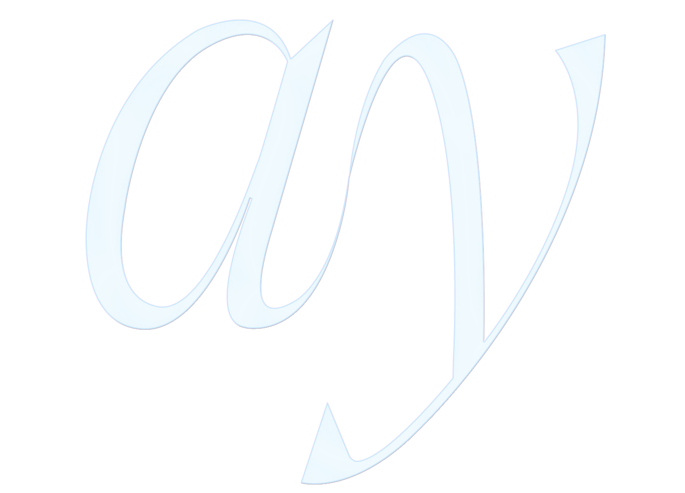
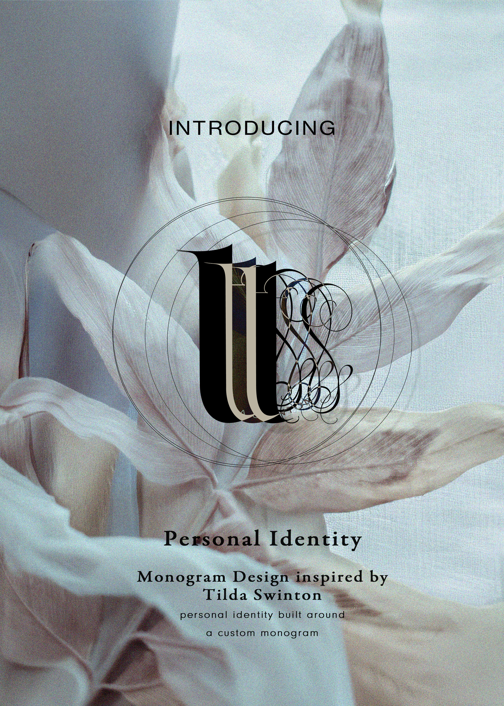
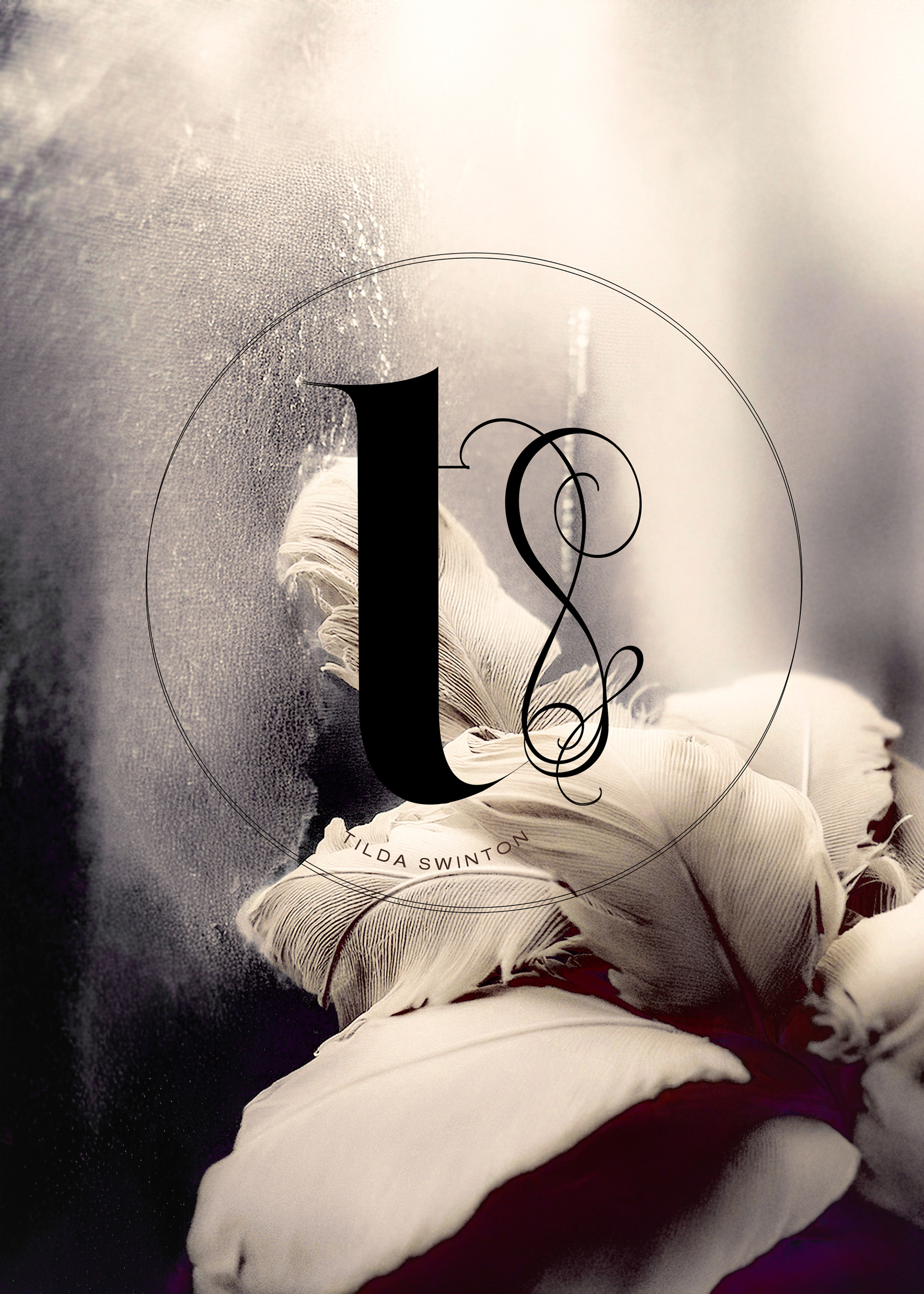
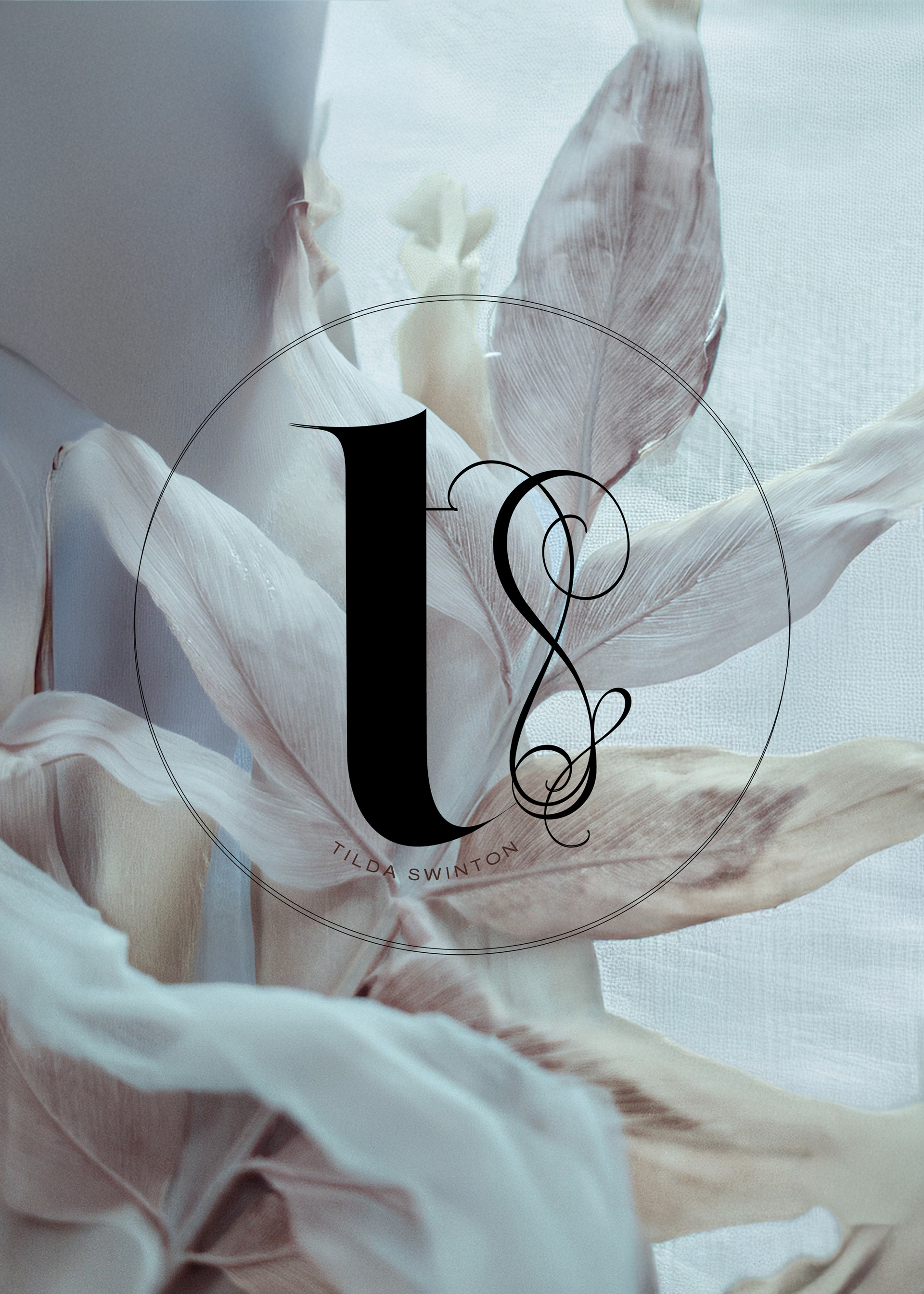
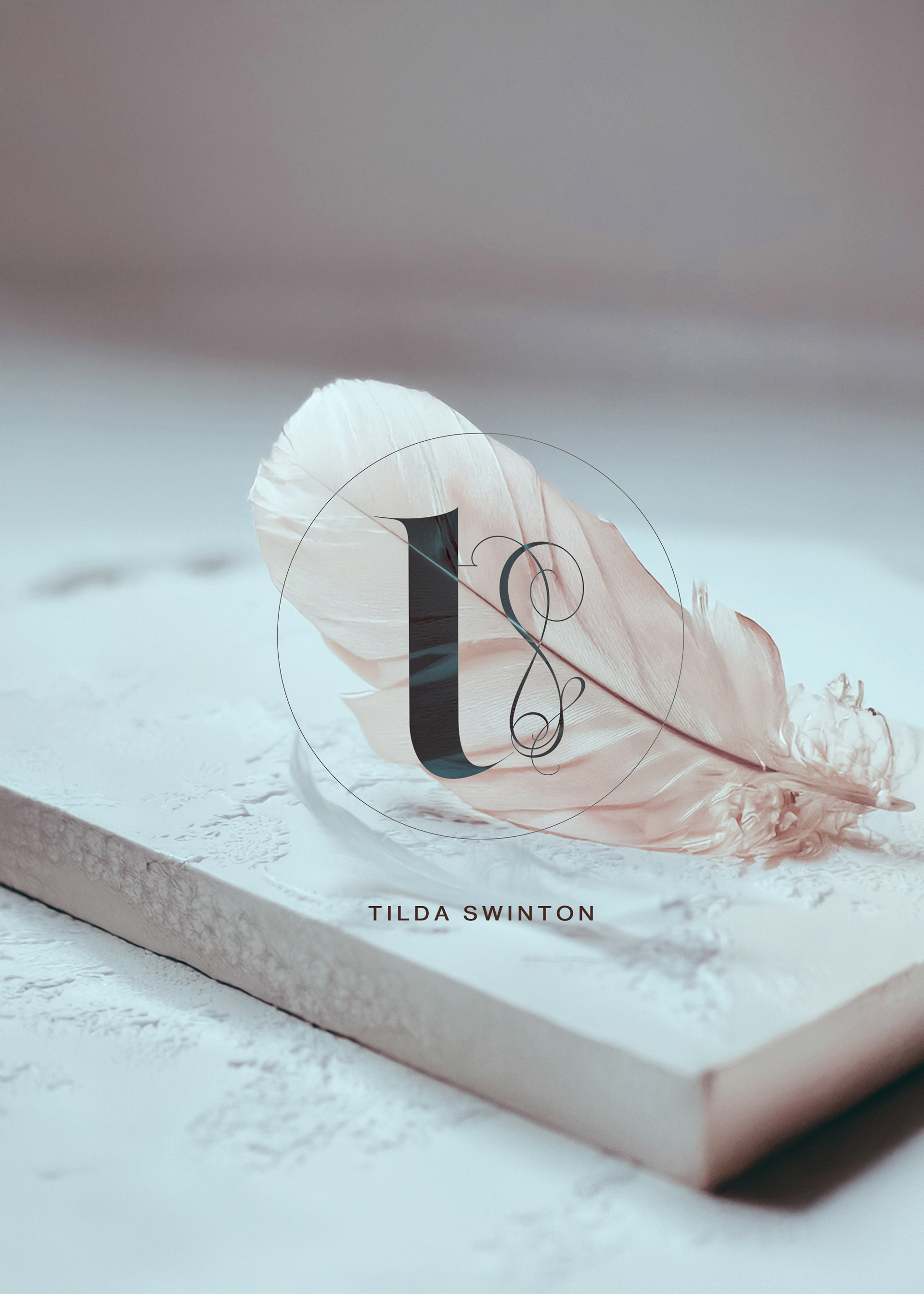
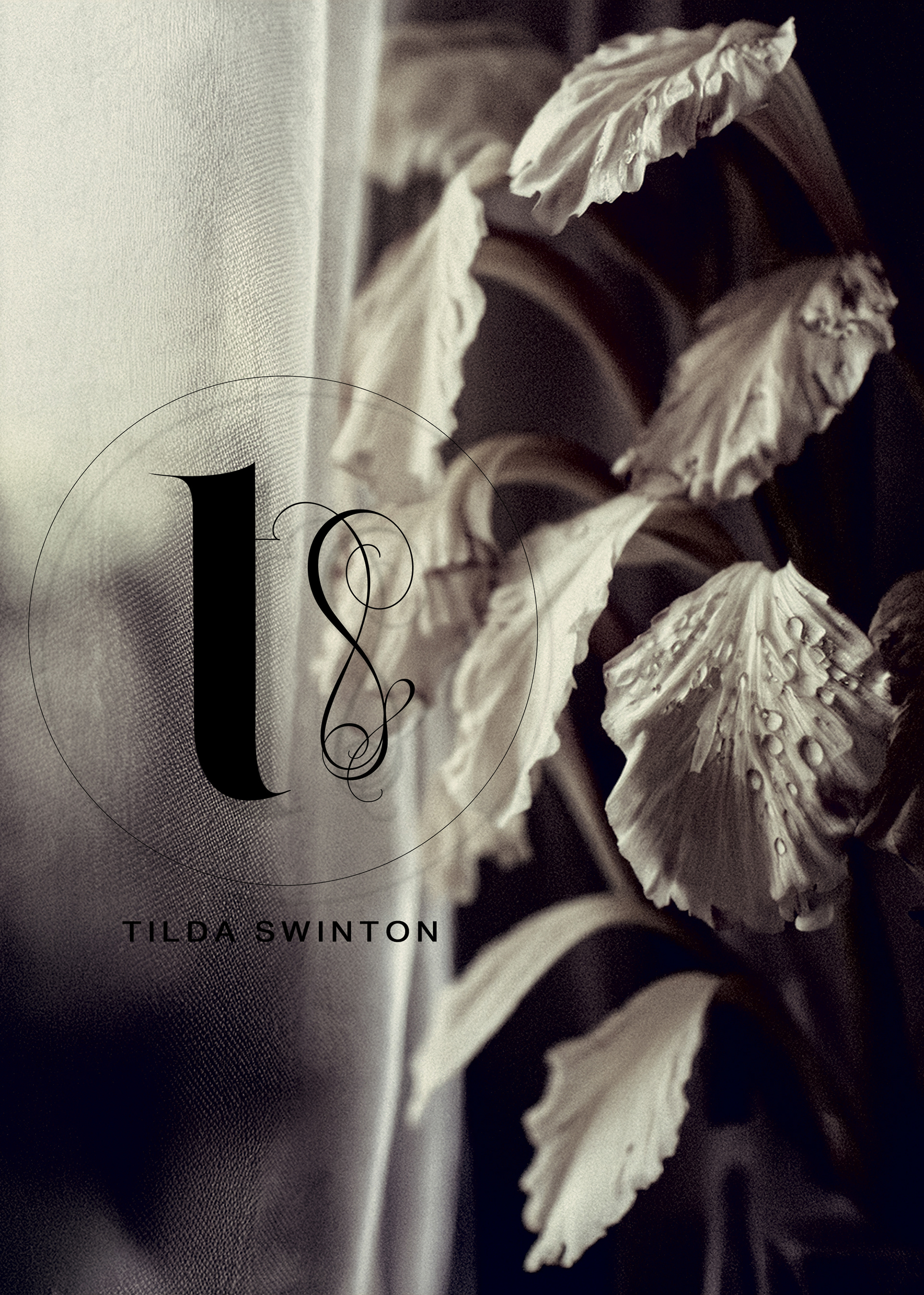
Tilda Swinton Monogram
—
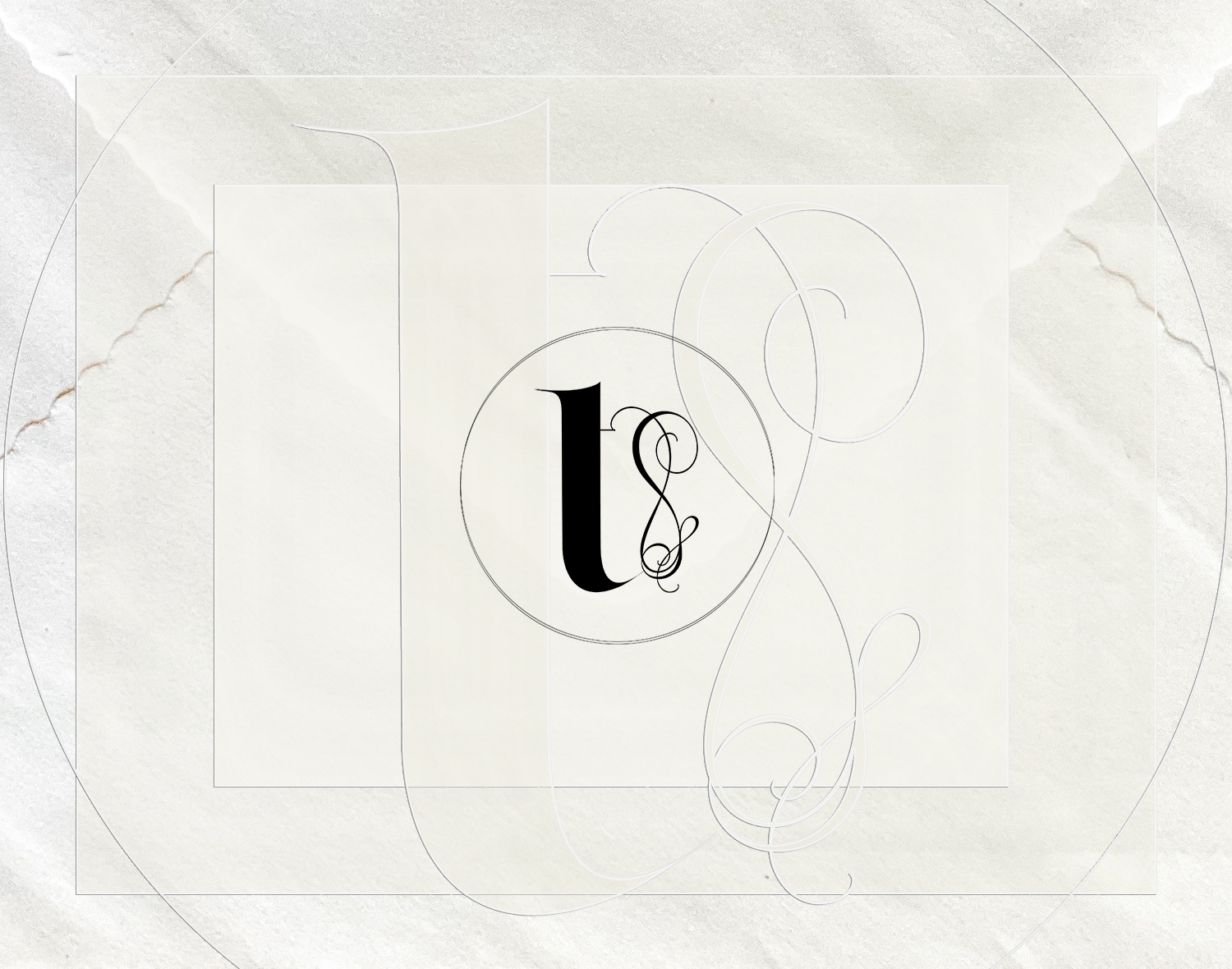
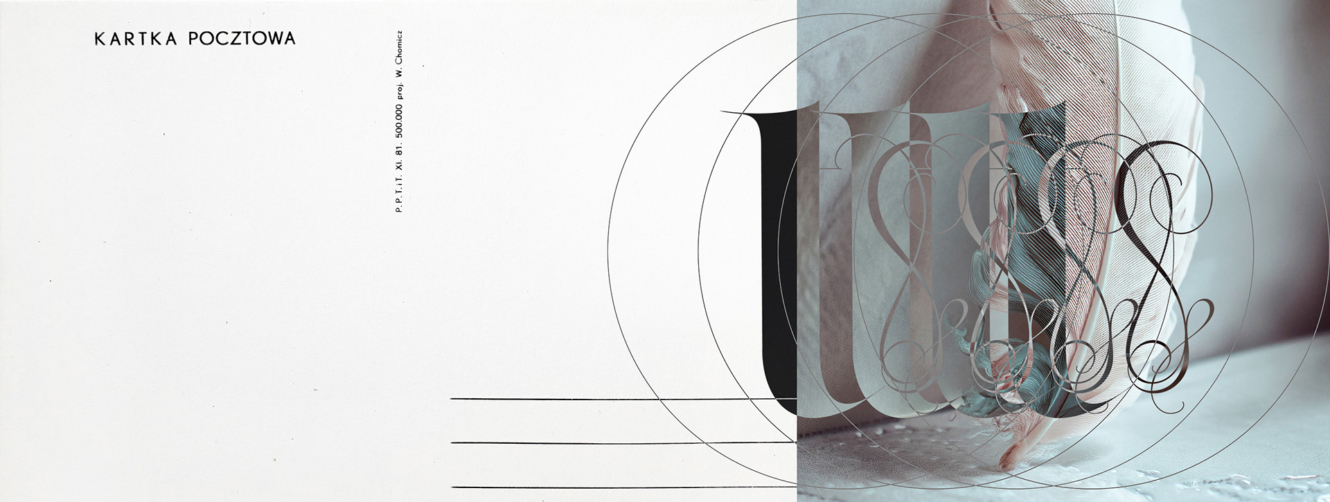
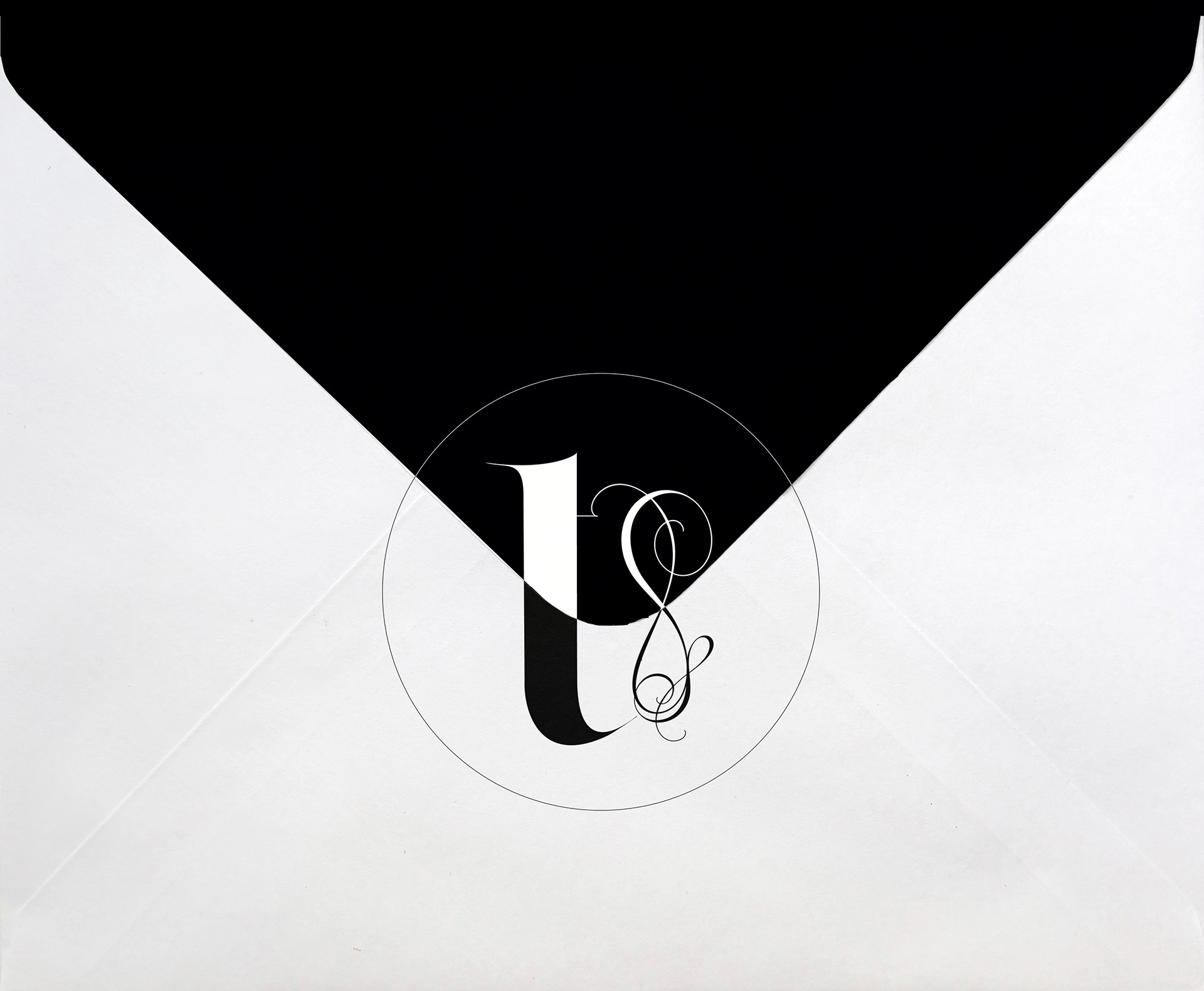
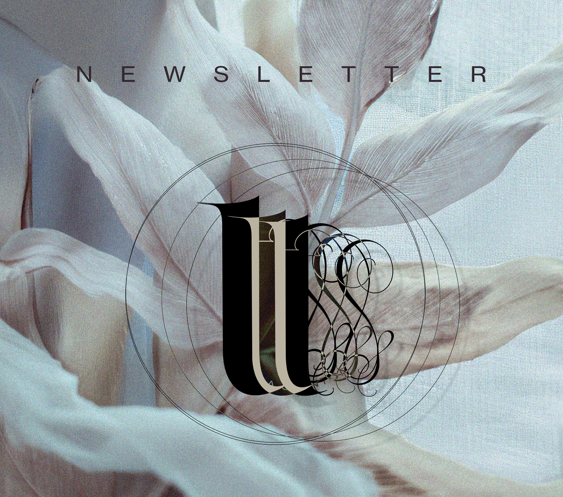
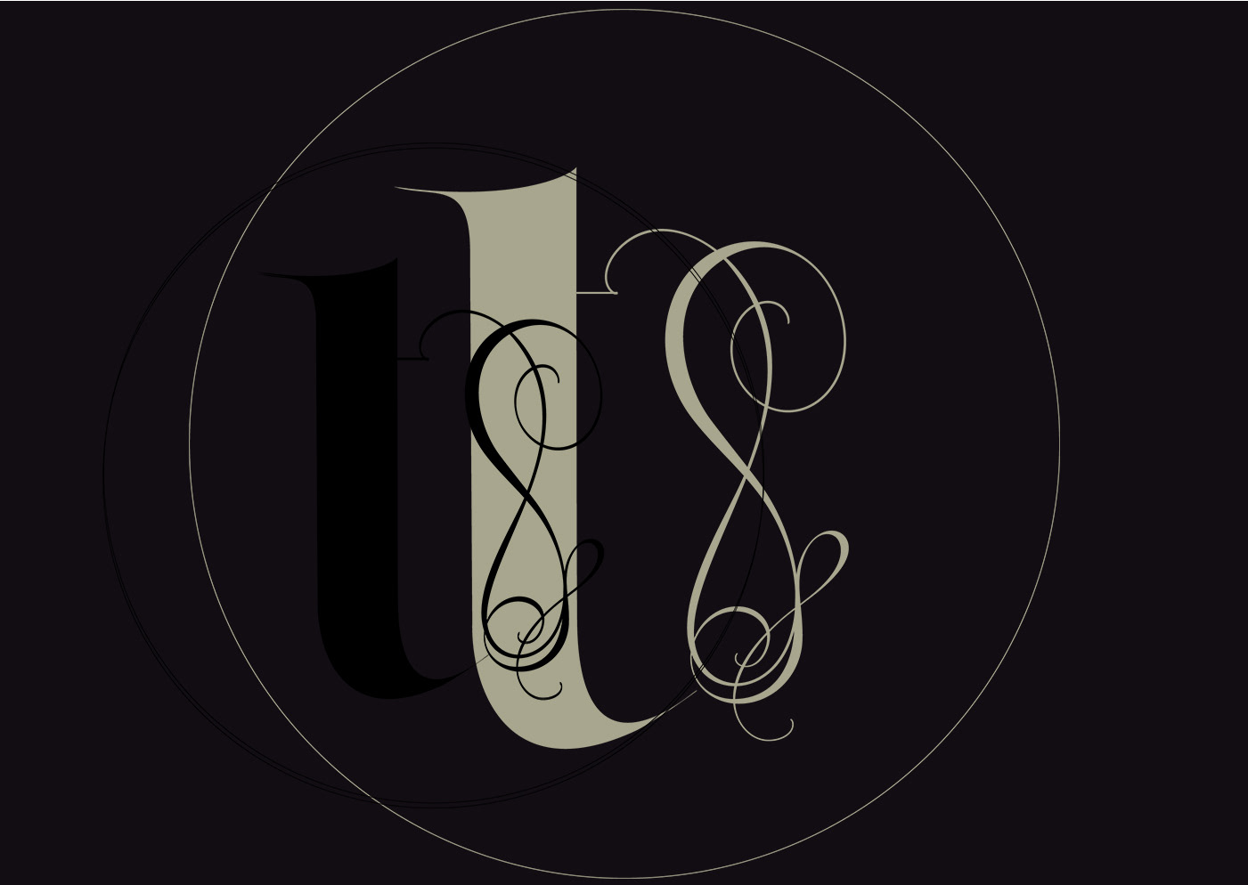
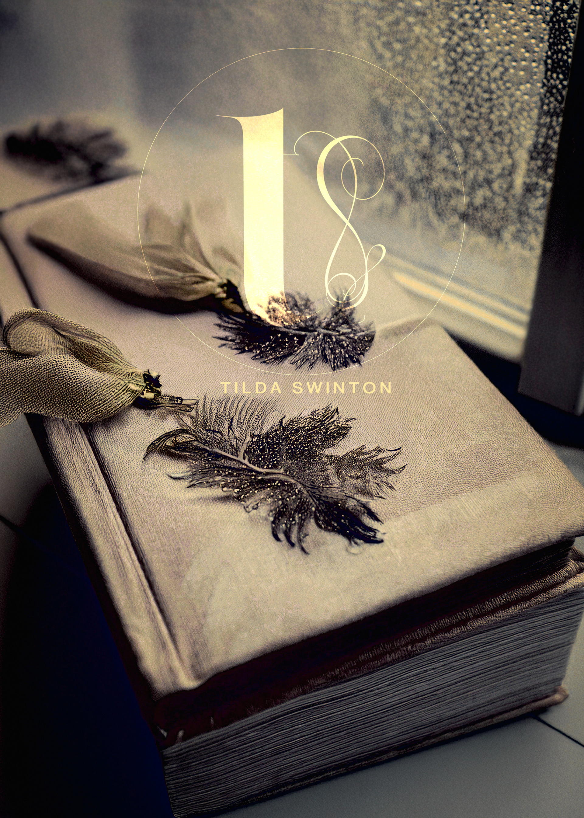
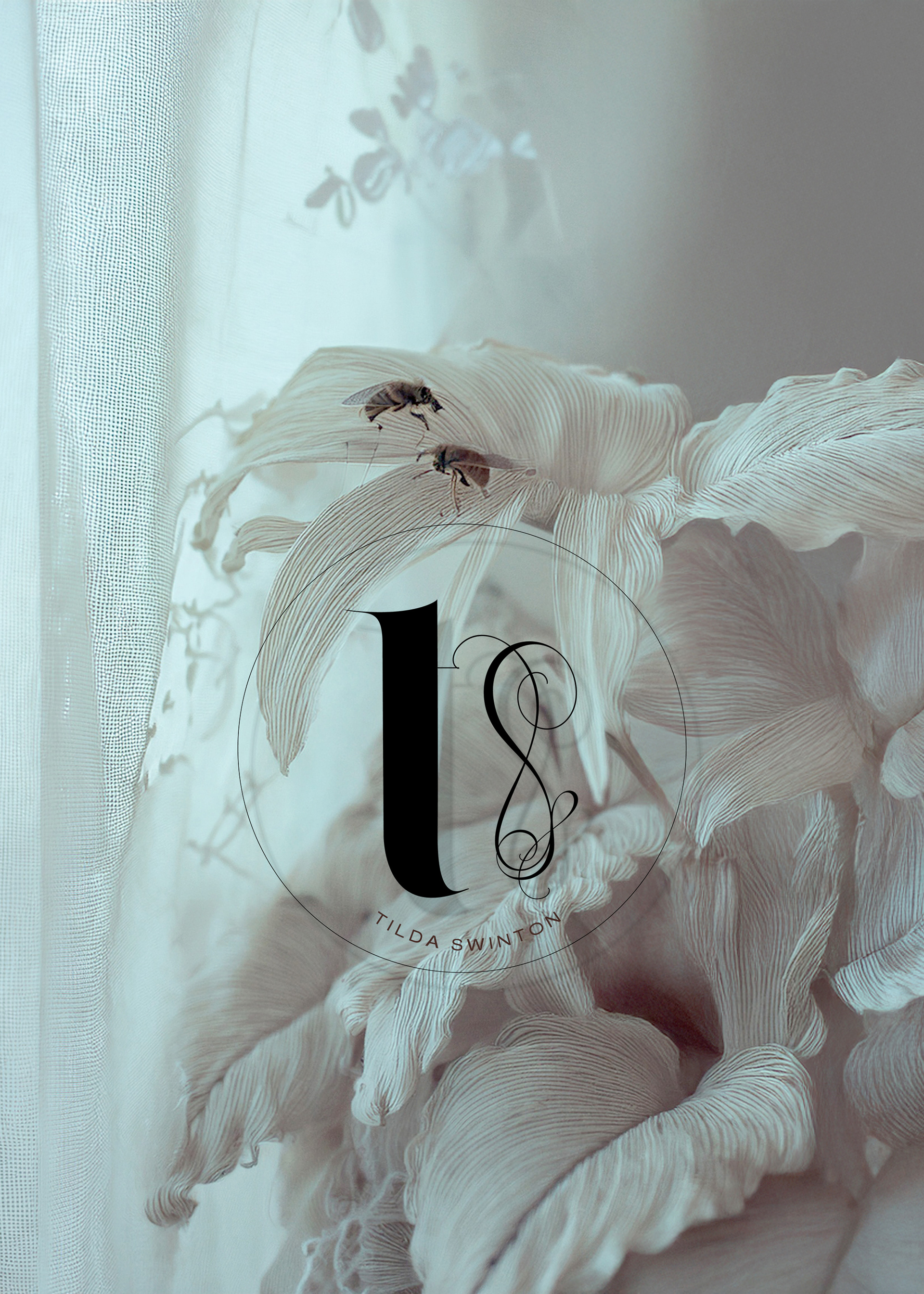
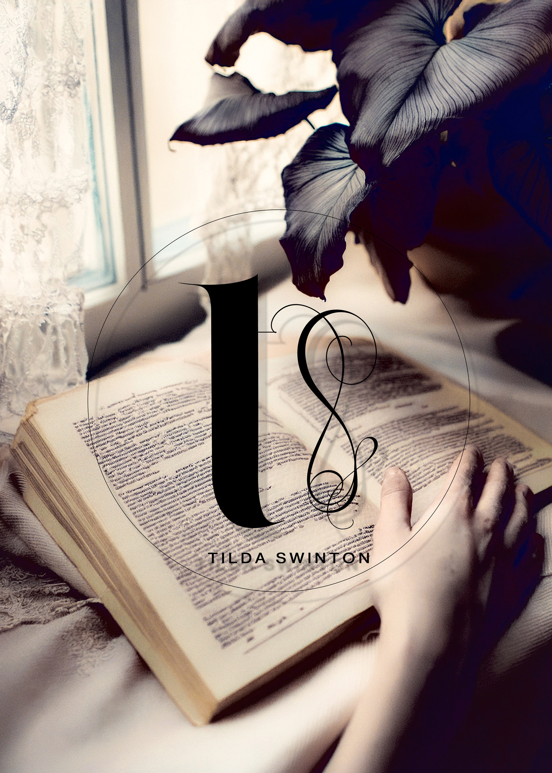
A minimal, atmospheric personal identity centered on a bespoke TS monogram, composed from Segol and Deseo, and treated as a fragile structure rather than a fixed emblem. The mark explores imbalance, lightness, and near-disappearance — allowing form, negative space, and tension to carry meaning instead of symmetry or dominance.
The identity favors restraint and precision, pairing the expressive monogram with a neutral, modern sans serif for naming and body text, creating a quiet hierarchy suitable for editorial, digital, and printed contexts. A limited, pale chromatic range reinforces themes of purity, transience, and high-art detachment.
Developed as a speculative personal identity for an iconic public figure, this project also functions as a reference framework for bespoke, non-traditional personal branding — designed to age gracefully and resist stylistic categorization.
Monogram

TYPOGRAPHY
• Primary mark: Segol Typeface (custom-modified monogram)
• Secondary Mark: Deseo Typeface
• Body & system text: Neue Haas Grotesk (Text / Roman)
Asymmetry of authority
The T dominates mass and gravity. The S refuses weight. This mirrors her presence: grounded yet ungraspable.
Temporal contrast
The T feels ancient, carved.
The S feels momentary, almost improvised.
Together they suggest time layered, not style.
Negative space discipline.
The restraint in overlap is excellent. The breathing room lets the S remain a shawl, not a knot.
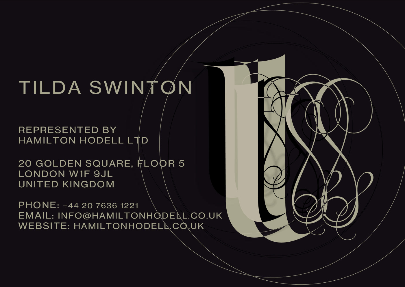
Culturally neutral but historically grounded.
No stylistic ego next to Segol.
Reads as identity infrastructure, not branding.
Beautiful contrast against an expressive monogram.
If this were a museum label under a symbol, this would be it.
This symbol is lived in. The name is simply stated.
That balance suits Tilda Swinton perfectly — presence without explanation.
personal postcard
personal ENVELOPE
personal newsletter
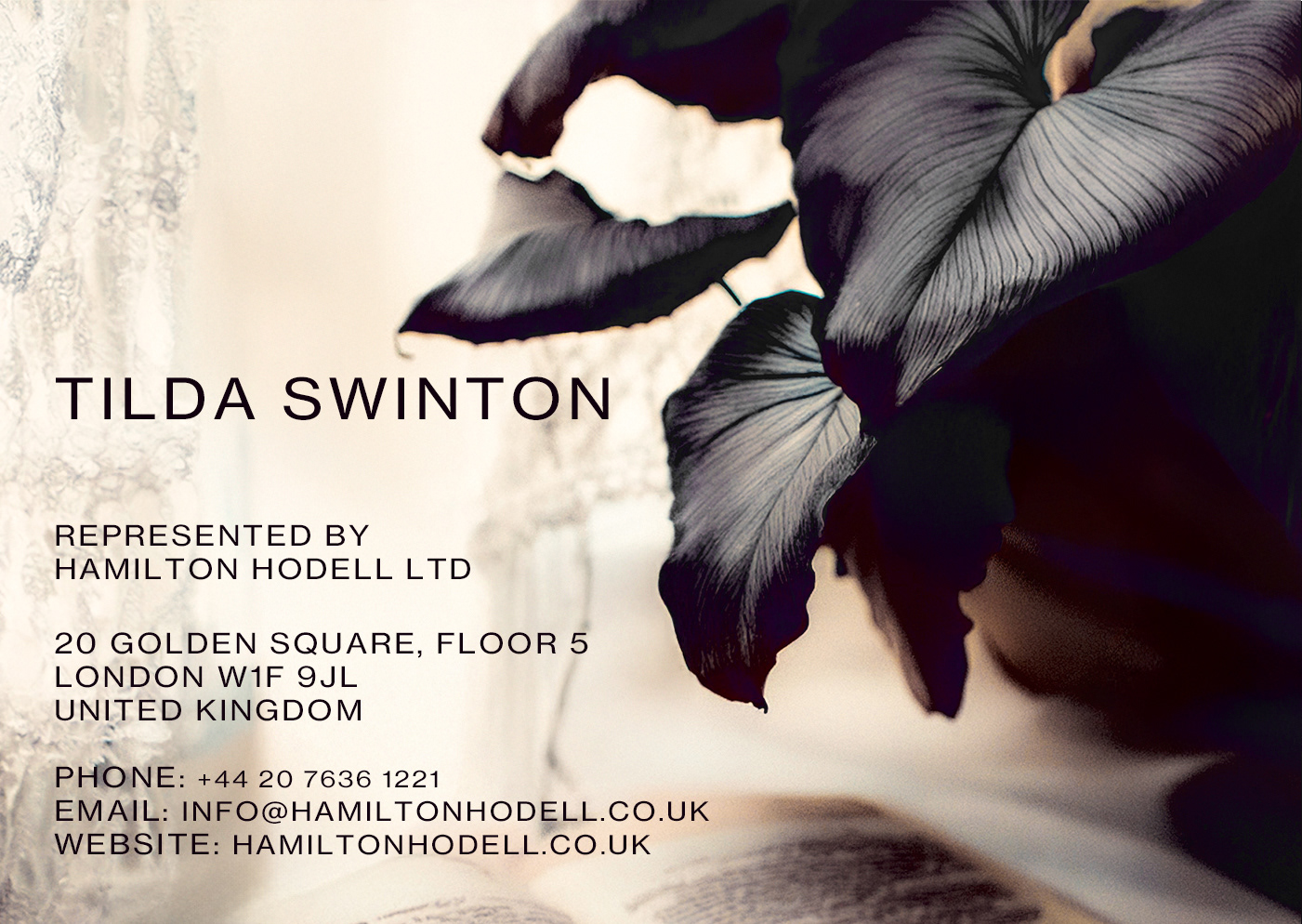
Business card

an advertisement
personal BRANDED IMAGERY


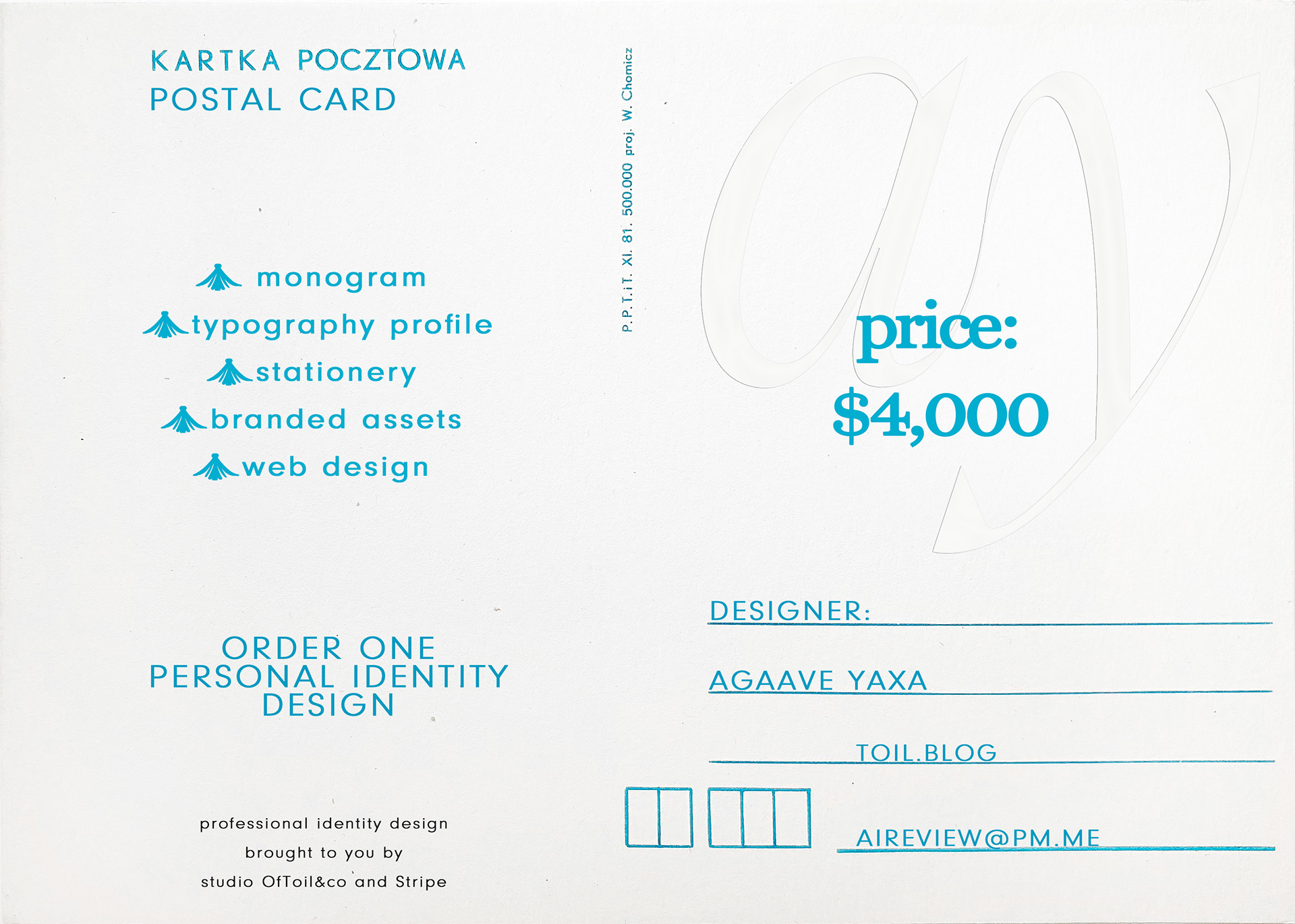
PURCHASE PERSONAL IDENTITY
via our Design Studio OfToil&co Stripe