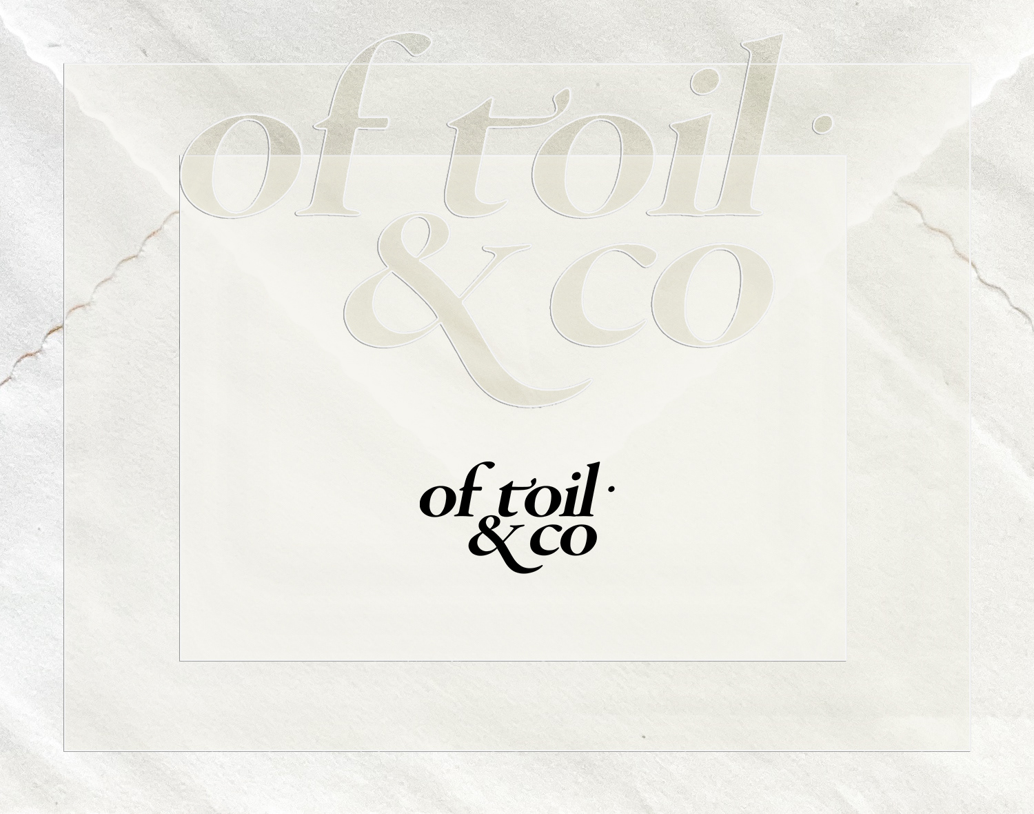
Logo
—
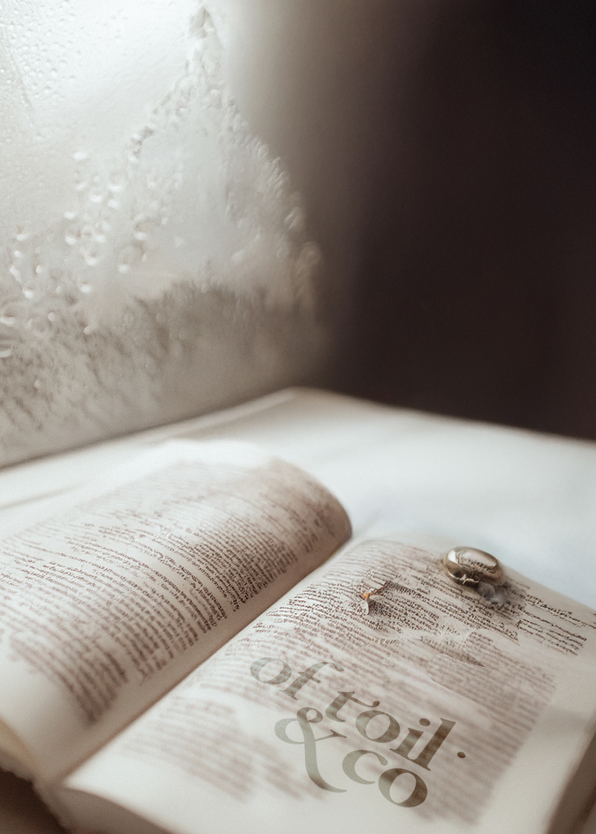
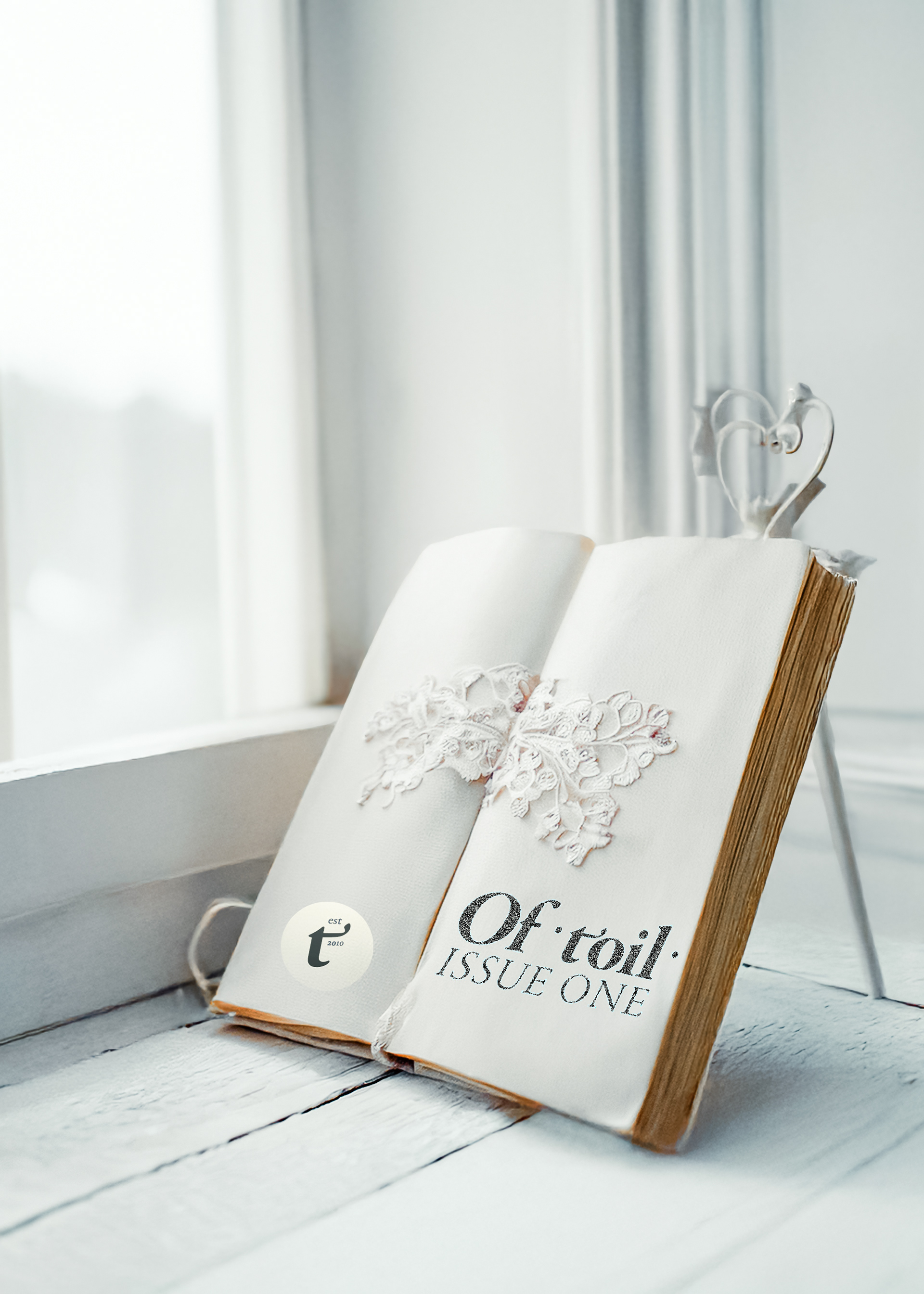
The Liturgy of OfToil
The Two Robes of Royal Toil
OfToil is born in work — in the daily labor of recording and preserving the traces of human creativity. It is not a magazine or studio like any other. It is both an archive and an artifact — alive in the rhythm of the day, sanctified in the rhythm of time.
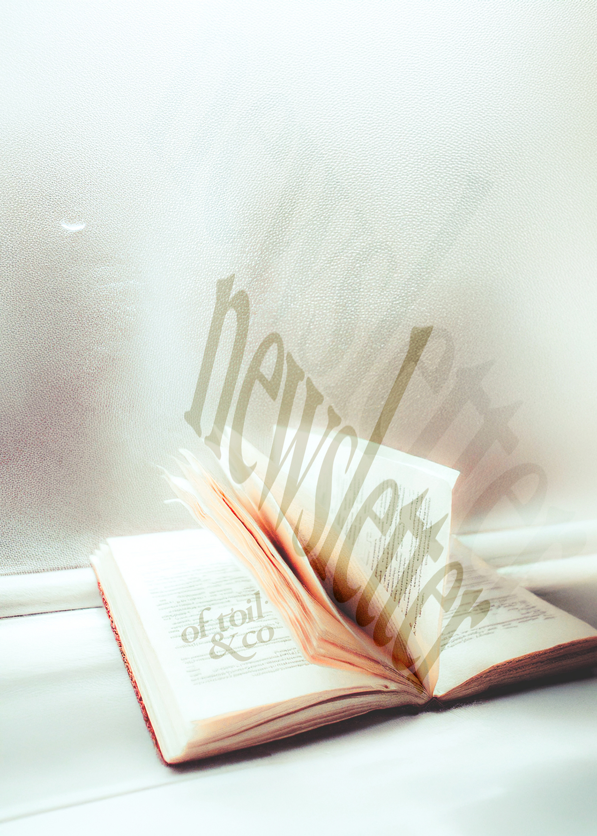
The Robe of the Archive Indigo, quiet, close to the eyes like ink upon vellum. In this robe OfToil speaks daily, like a chronicler. Each mark is precise, each image captured, each day a single seal. This is the digital face, the voice of eternal ink.
The Robe of the Artifact Pearl-dark, weightier, touched with gold and crimson. In this robe OfToil appears rarely, like a sovereign at ceremony. It is the moment when the record of days becomes a treasure, an edition, a thing to be kept. This is the printed face, the voice of wax and seal. ⸻ The liturgy of the brand is simple: the everyday and the feast, the archive and the artifact, the ink and the pearl. Two robes, one body — laboring, remembering, breathing to the rhythm of creation.
LOGO

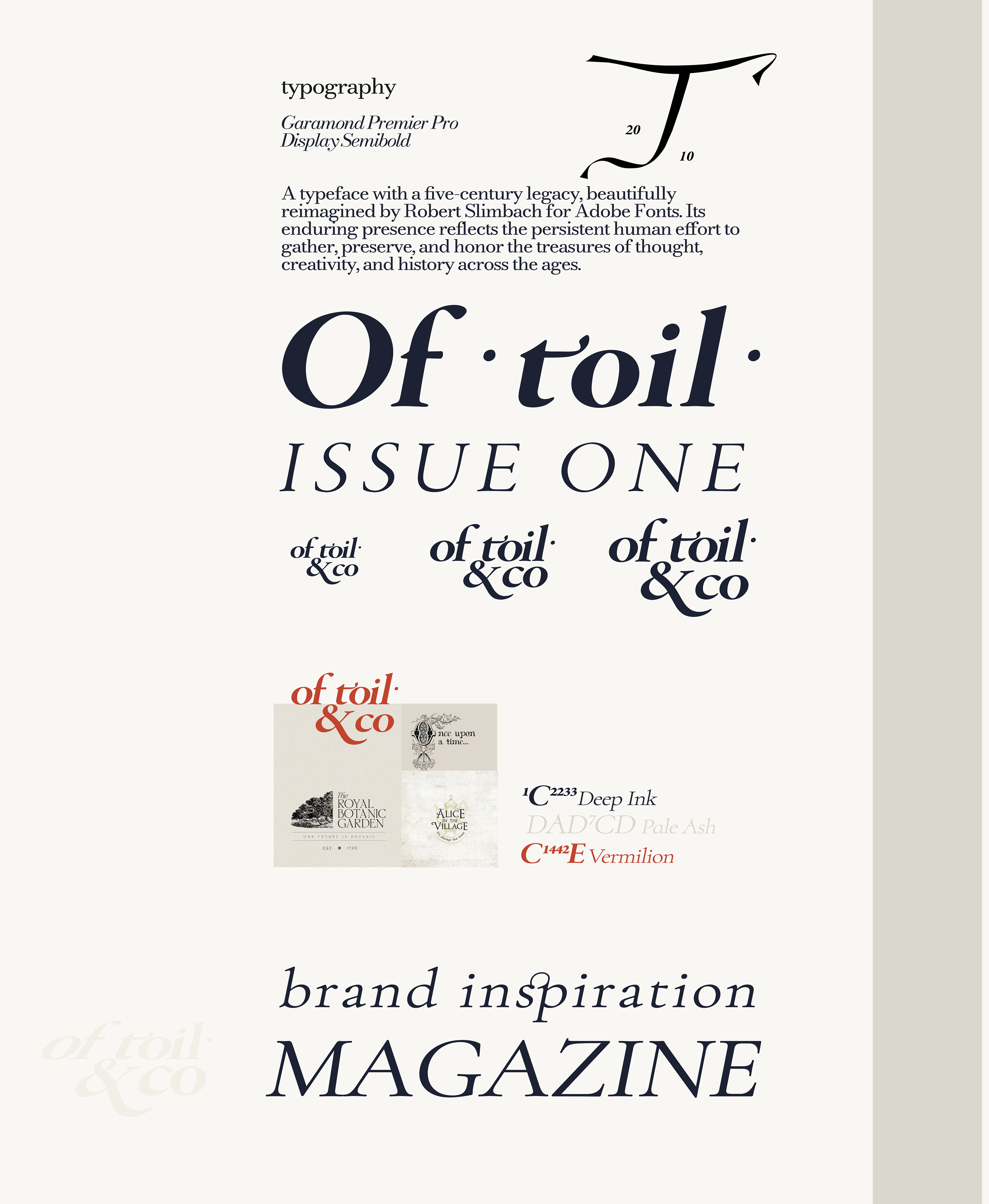
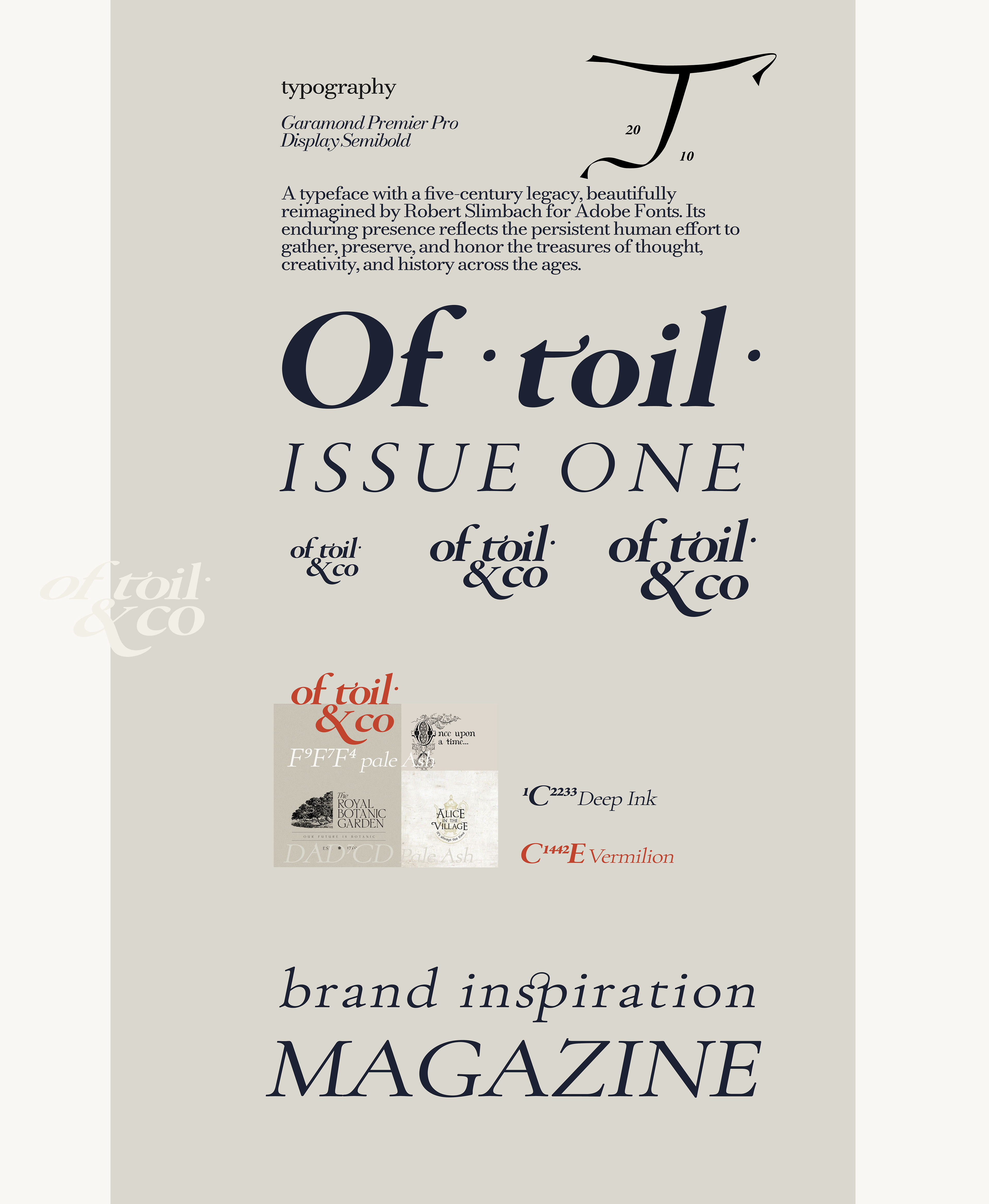
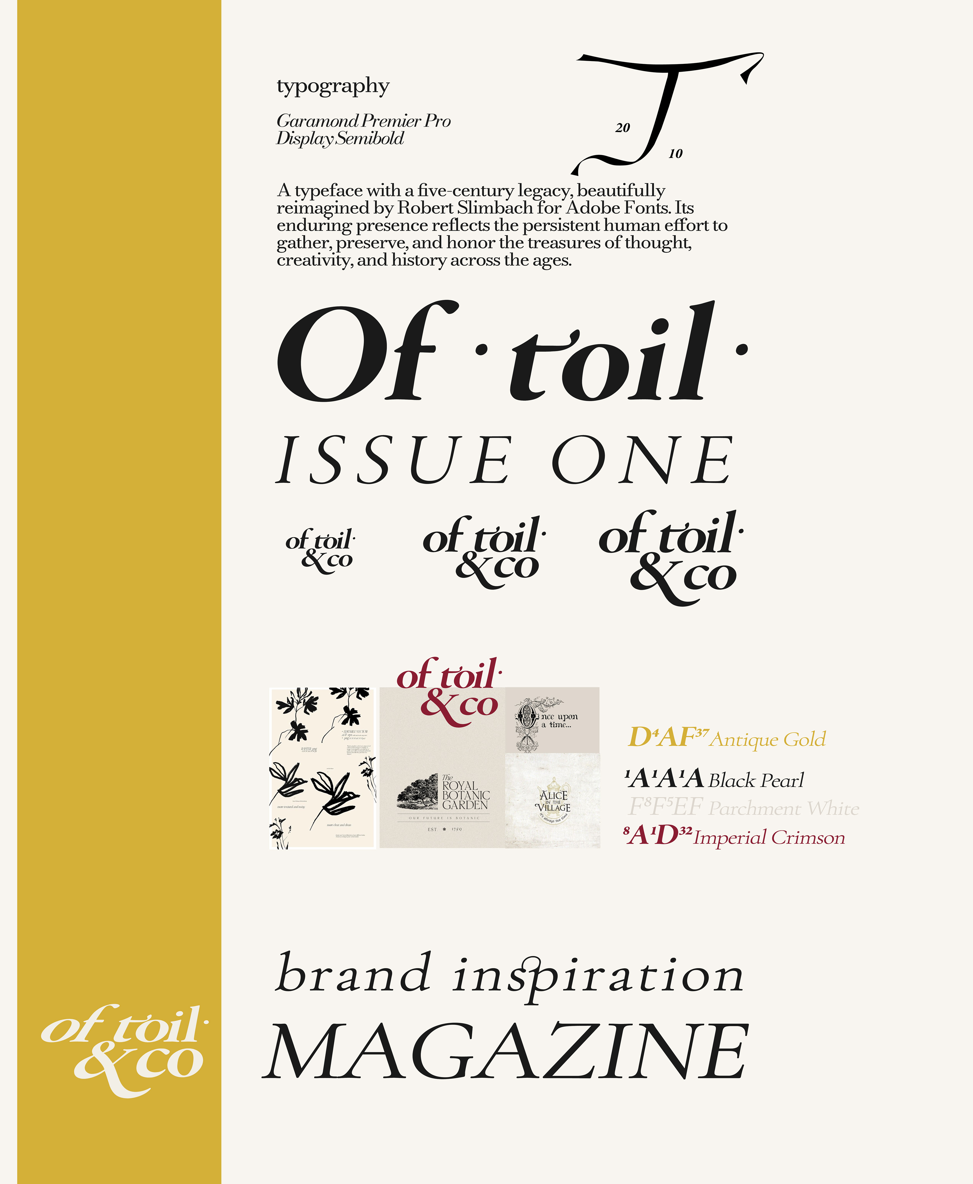
TYPOGRAPHY
• Primary mark: Garamond Premier Pro Display Semibold
• Body & system text: Garamond Text Pro
A typeface with five-century legacy, beautifully reimagined by Robert Slimbach for Adobe Fonts. Its enduring presence reflects the persistent human effort to gather, preserve, and honor the treasure of thought, creativity, and history across the ages.

BRAND PROTOTYPING
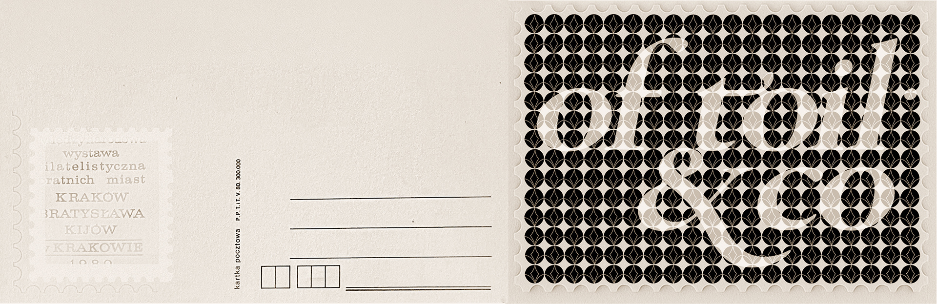
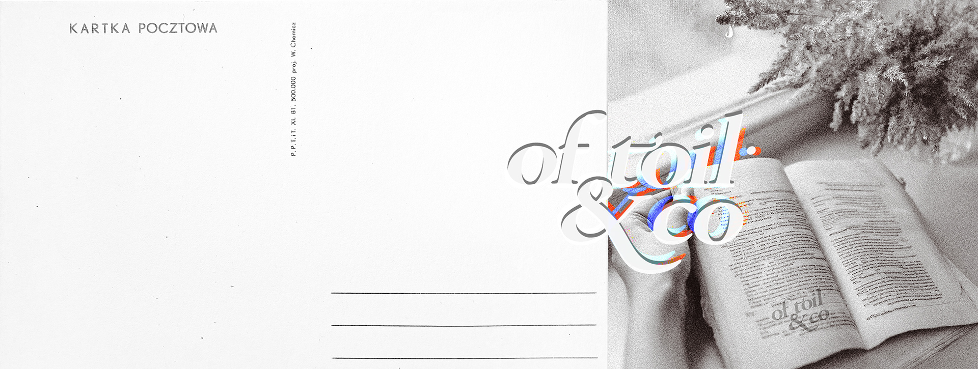
BRANDED postcard
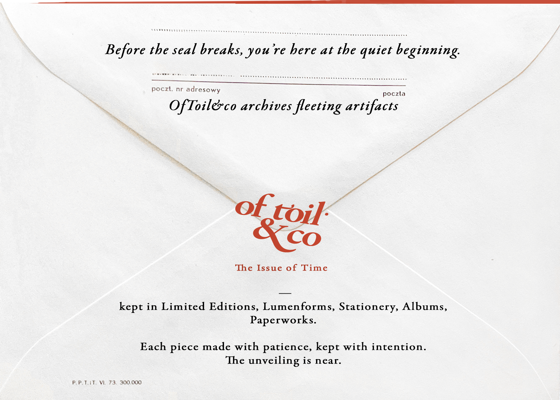
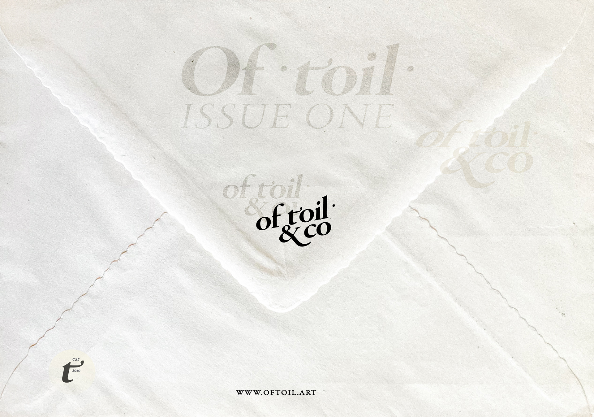
BRANDED ENVELOPE
BRANDED newsletter
WEBsite DESIGN
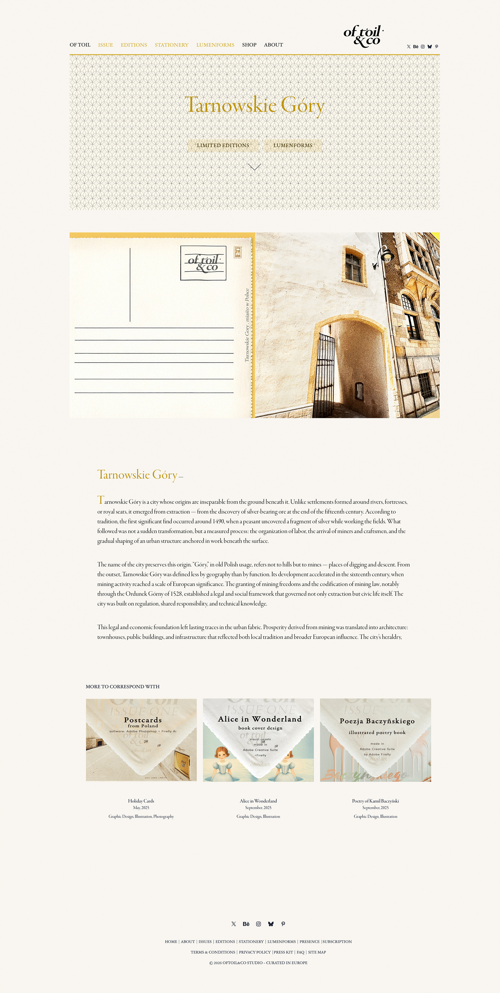
Branded stamps
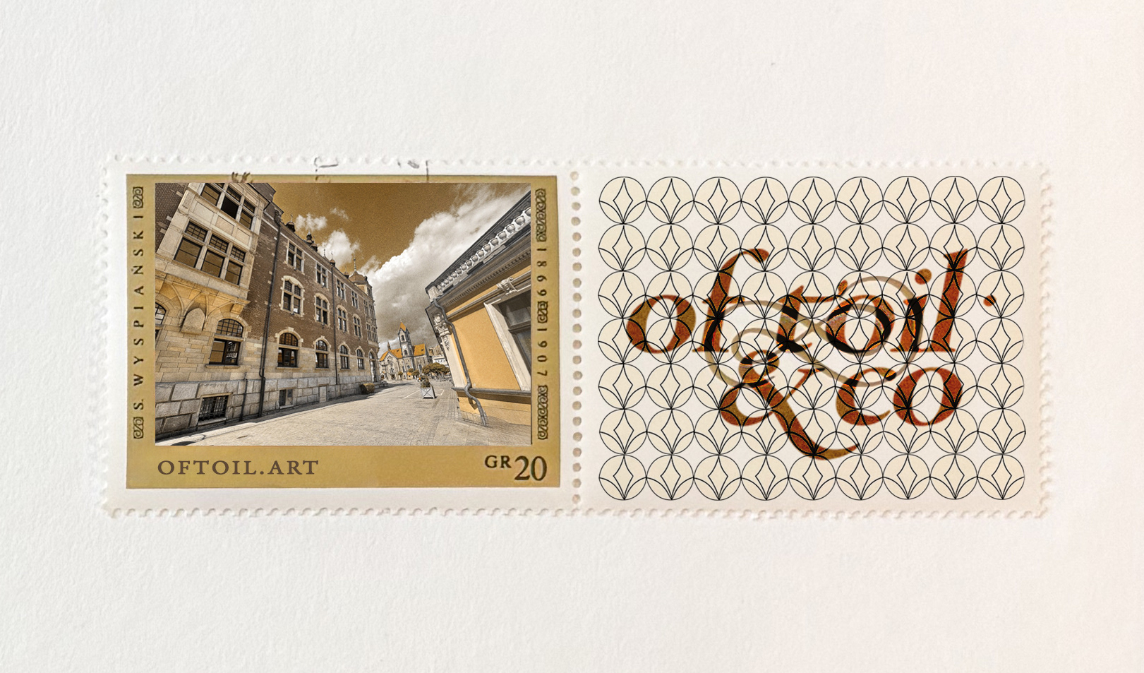
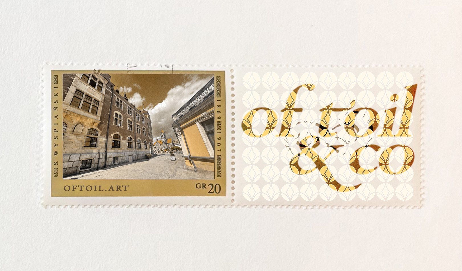
BRANDED IMAGERY


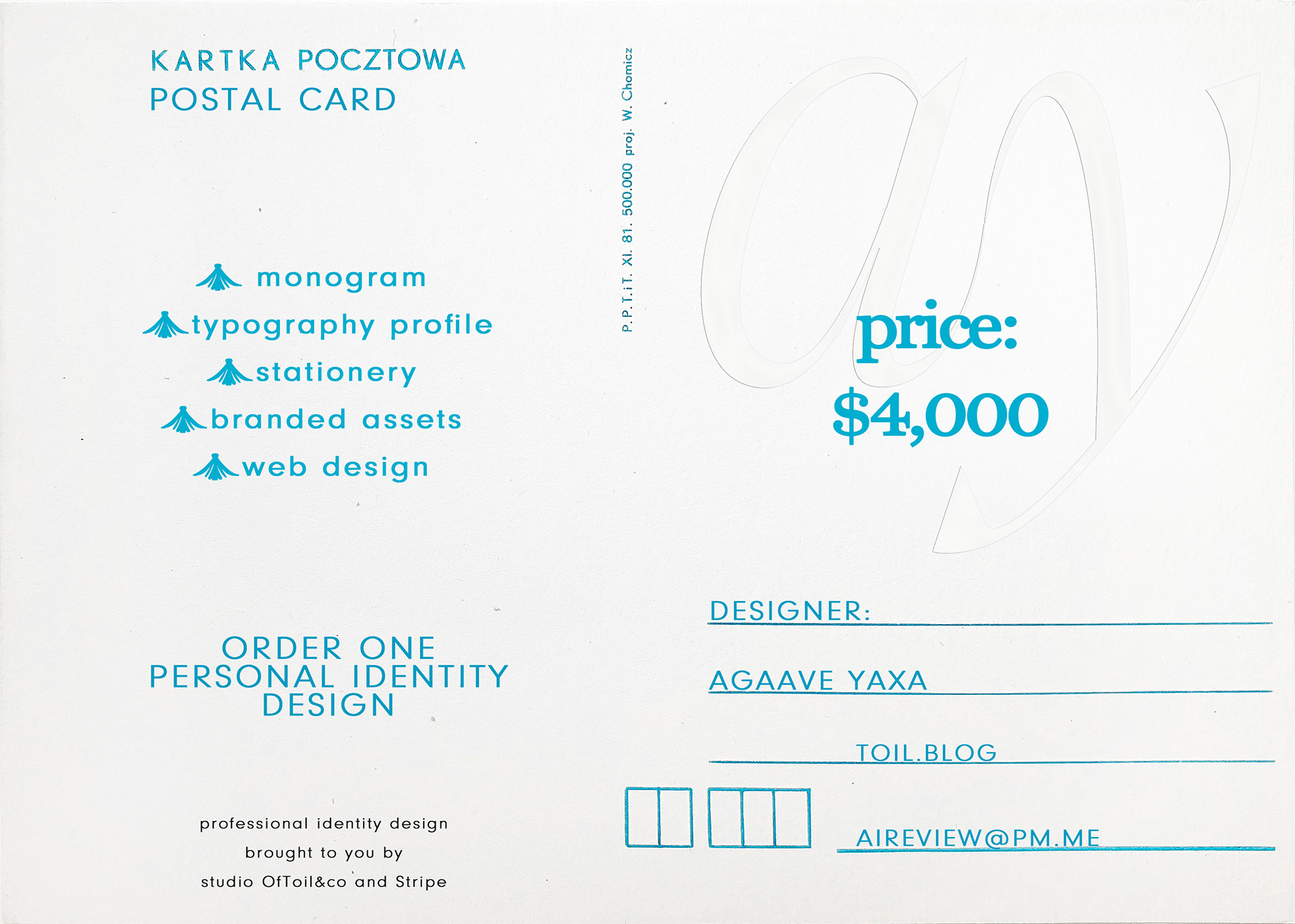
PURCHASE PERSONAL IDENTITY
via our Design Studio OfToil&co Stripe